

ORO Connect
B2B jewellery · bulk ordering · catalogue at scale · ORO Precious Metals
A 70,000-piece catalogue a buyer can actually shop
ORO manufactures its own line of gold and platinum jewellery and supplies retailers and distributors at scale. Their buyers were placing bulk orders through a system that made them recall exact SKUs from memory — and phone someone whenever it went wrong. Every one of those calls was a sale slowed down. I rebuilt ordering around discovery instead of data entry, across desktop and mobile, so the catalogue does the remembering.
They were treating it as an order form. The job was a catalogue.
ORO's buyers were not shopping. They were filing paperwork.
ORO Precious Metals is a B2B jewellery manufacturer that designs and produces its own line of bangles and fine jewellery, supplying large-scale retailers and distributors across several markets. Traditional craftsmanship, modern design sensibilities, and an inventory big enough that no one person can hold it in their head.
An ERP system and a companion mobile app already existed for bulk orders. Both worked, in the narrow sense that orders did eventually get placed. But the flow assumed the buyer already knew exactly what they wanted, down to the internal design number — and when that assumption broke, which was often, the fix was to call someone at ORO.
Every order that needed a phone call was a design failure wearing a customer-service costume.
I audited the existing platform before proposing anything. The issues were not cosmetic — the structure itself was working against every kind of buyer, and each one failed differently.
Small traditional shops struggled with complex online forms and feared typos when reordering exact SKUs. Mid-sized chains wanted light tweaks to curated designs but had no real-time pricing or clear mockups to work from. Large multi-store buyers needed a single source of truth — filterable specs, bulk RFQ uploads, transparent lead times — and instead clicked through dozens of pages. New prospects saw no concrete ROI, could not easily request samples, and endured slow partner-approval cycles.
As a result, ORO loses sales, incurs order errors, and wastes time on manual back-and-forth.
The system asked buyers to recall, not recognise
Ordering meant entering ORO's internal design numbers. A buyer placing a repeat order for a bangle they had sold for years still had to produce a code from memory or dig through a spreadsheet. Mistyped numbers meant wrong stock, and wrong stock on a bulk gold order is expensive in both money and trust.
No design system, and the interface showed it
There was no shared component language in the previous app. Beyond the visual inconsistency, there were clear violations of Hick's and Fitt's laws throughout — choices multiplied where they should have been narrowed, and the controls people used constantly were no easier to hit than the ones they never touched. This had to be a design-first overhaul, not a reskin.
People don't see a website, they browse.
I built four buyer profiles from stakeholder conversations. They are in this case study only because each one forced a specific decision — a persona that changes nothing is a slide, not research.
The traditional bulk buyer forced the reorder path
Mohan, 52, not tech-savvy, reorders known lines and fears overstock. He is why reordering never requires typing a design number, and why past orders are a first-class surface rather than buried history.
The brand-aware customiser forced visual reference
Seema tweaks existing lines to protect brand equity and needs to see what she is changing. She is why customisation happens against an image with live pricing, not on a blank request form.
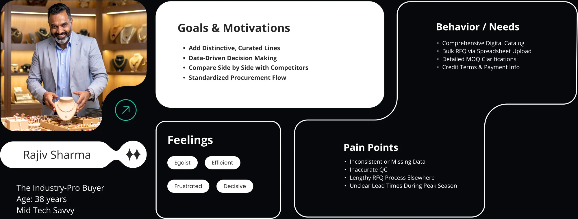
The industry-pro buyer forced search at scale
Rajiv compares suppliers, wants curated lines and bulk RFQs, and works from data. He is why search had to survive 70,000 entries and why minimum order quantities are stated up front rather than discovered in negotiation.
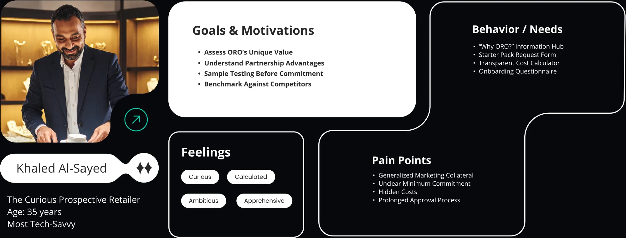
The prospective retailer forced the case for ORO
Khaled has never bought from ORO and is assessing whether it is worth starting. He is why the landing page leads with what ORO makes and why sampling has a route that does not begin with a sales call.
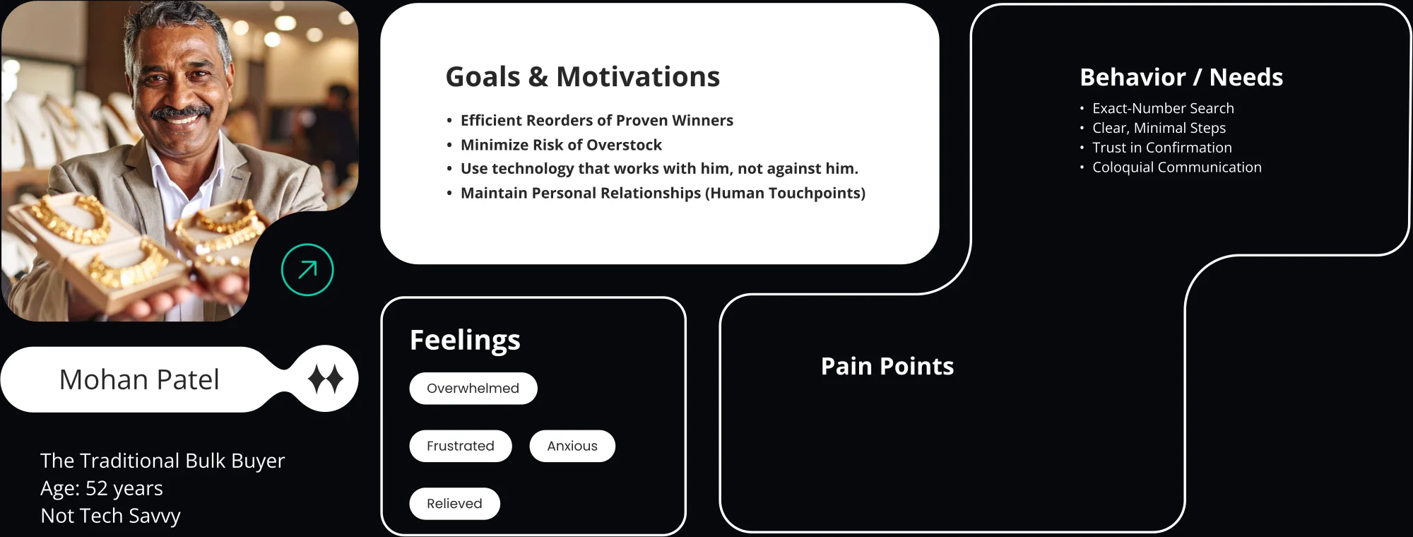
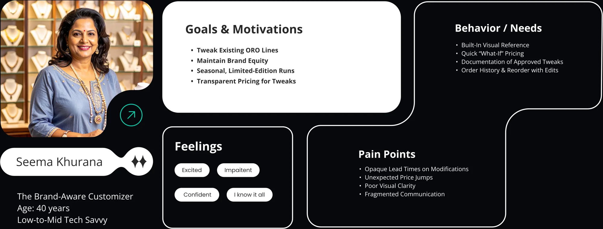
Mohan Patel — R1 · The Traditional Bulk Buyer
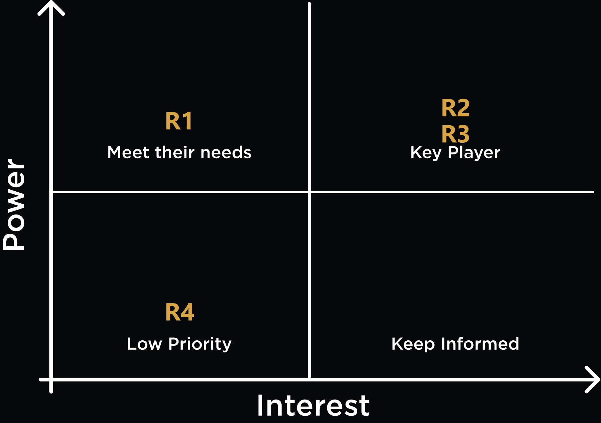
Segmenting mattered more than covering everyone. The system could not serve every buyer equally well, so I plotted them on a power-interest matrix with stakeholders and let that decide who wins when two needs conflict.
Information architecture
Mapping the full flow was what made the scale of the problem legible. Once every moving piece was on one surface — catalogue, product collections, the configurator, retailer onboarding, cart, order history, and the two ID systems running underneath — it was obvious which screens were carrying more than they should.
I used the Moon design system as the foundation rather than building components from scratch. With one designer and three months, inventing a component library would have consumed the time the actual problem needed — and the aesthetic already matched the direction I wanted.
People don't see a website, they browse.
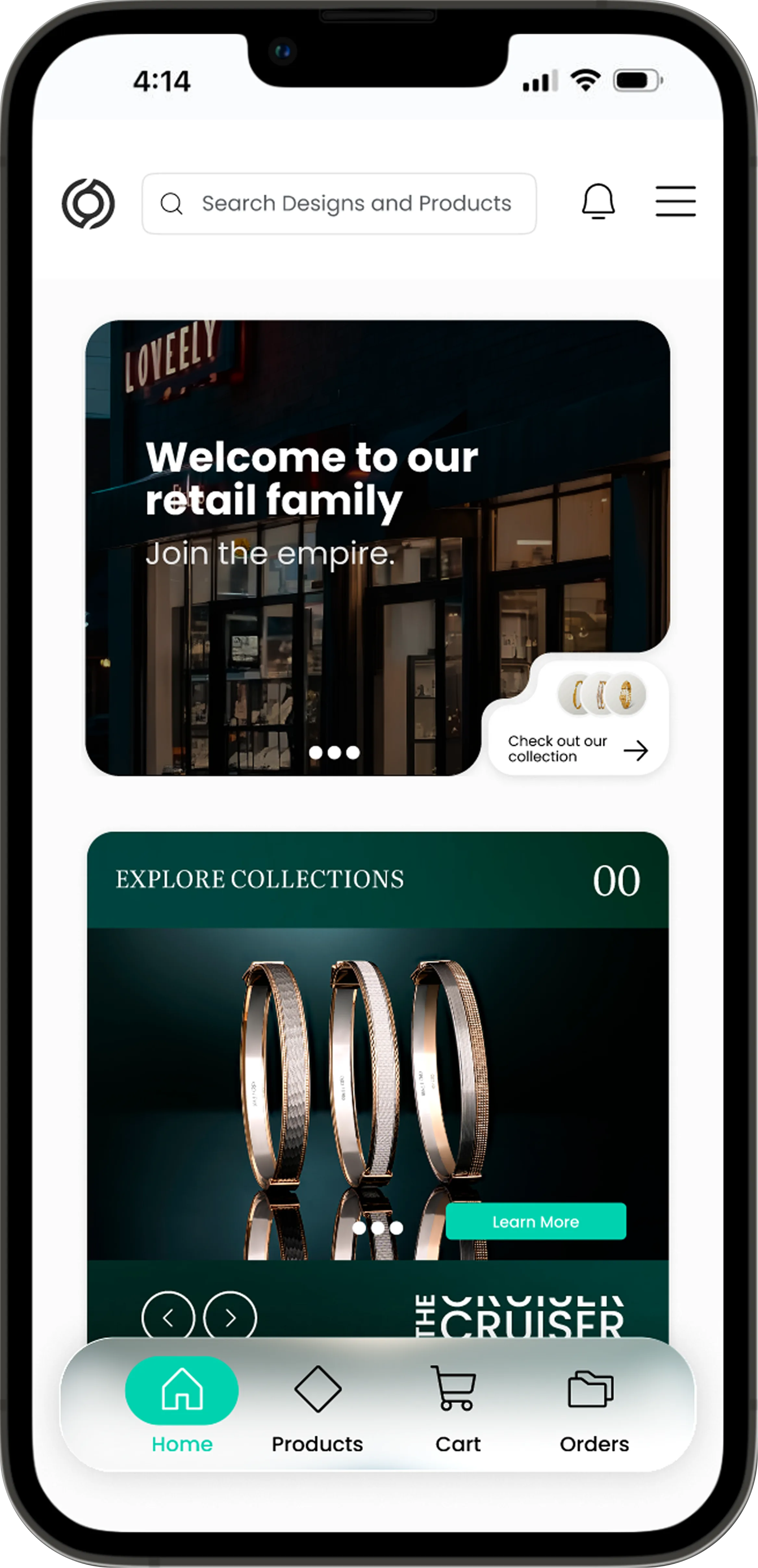
A landing page that opens on the brand
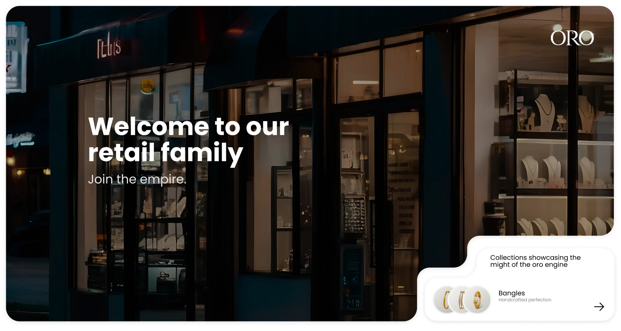
The landing page leads with ORO's world — the retail family, the craft, the collections — rather than a bare search field. A search field only helps someone who already knows what to type, and three of the four buyer profiles did not.
This is the screen that turns the product from a form into a catalogue. Everything downstream depends on the reader having somewhere to start.
More than 70,000 designs, two tiers of filters.
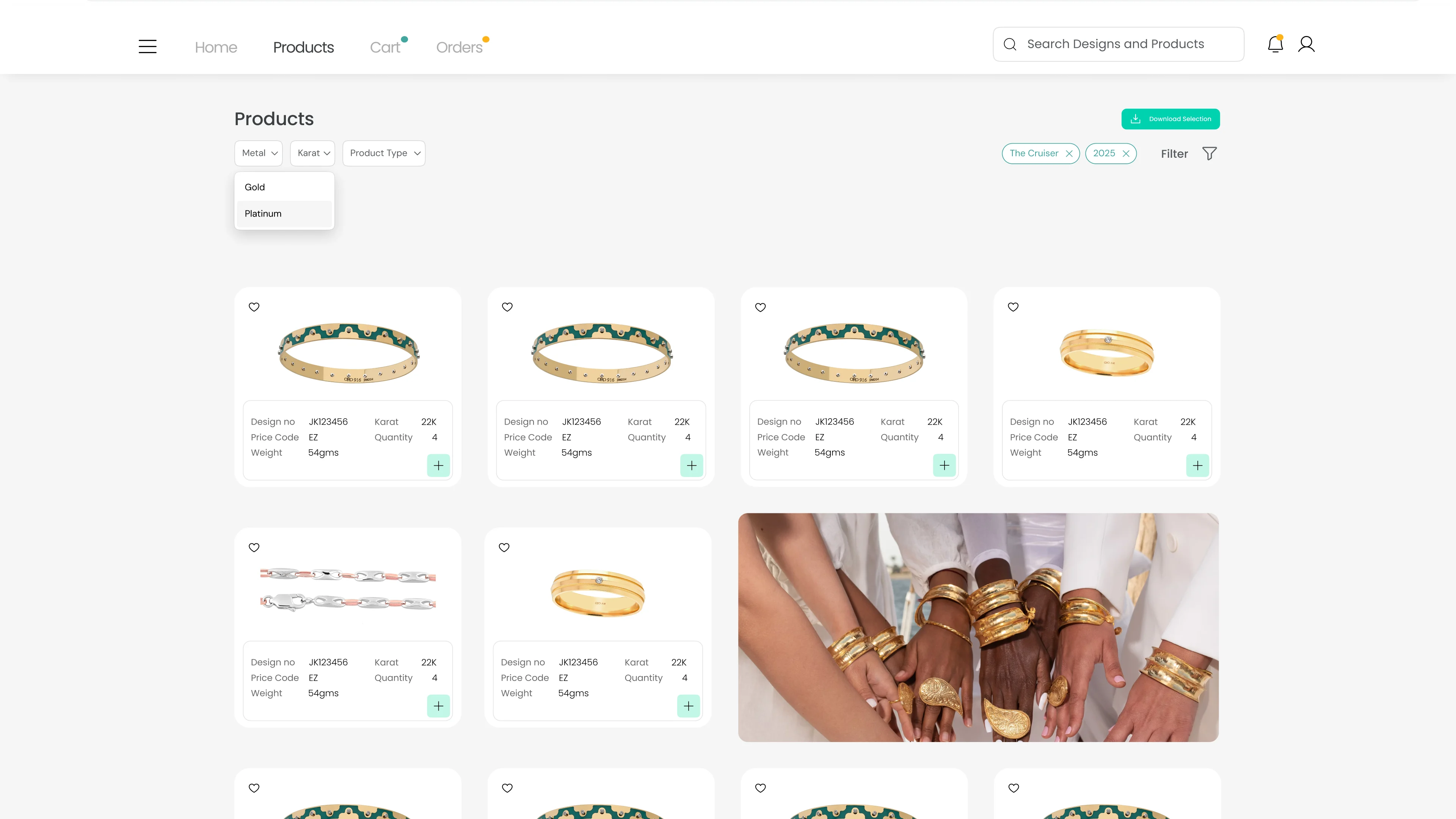
A products page built to survive the inventory
Hosting the full catalogue meant two separate tiers of filters — broad category narrowing first, then specific search parameters — so the page could load and stay usable at that scale rather than collapsing into an endless grid.
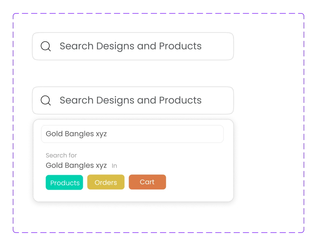
Search by intent, because a static bar was useless here.
Search that scopes itself, and cards that animate
The fix was filtering search results by intent: the buyer says whether they want this thing in products, orders, or cart, and the query is scoped before it is sent. The technical ceiling produced a better interaction than an unconstrained search would have.
The product cards carry ORO's own animation language — micro-interactions on hover that break information fatigue as the card goes from text to a smooth zoomed-in shot of the piece.
The biggest challenge in the product.
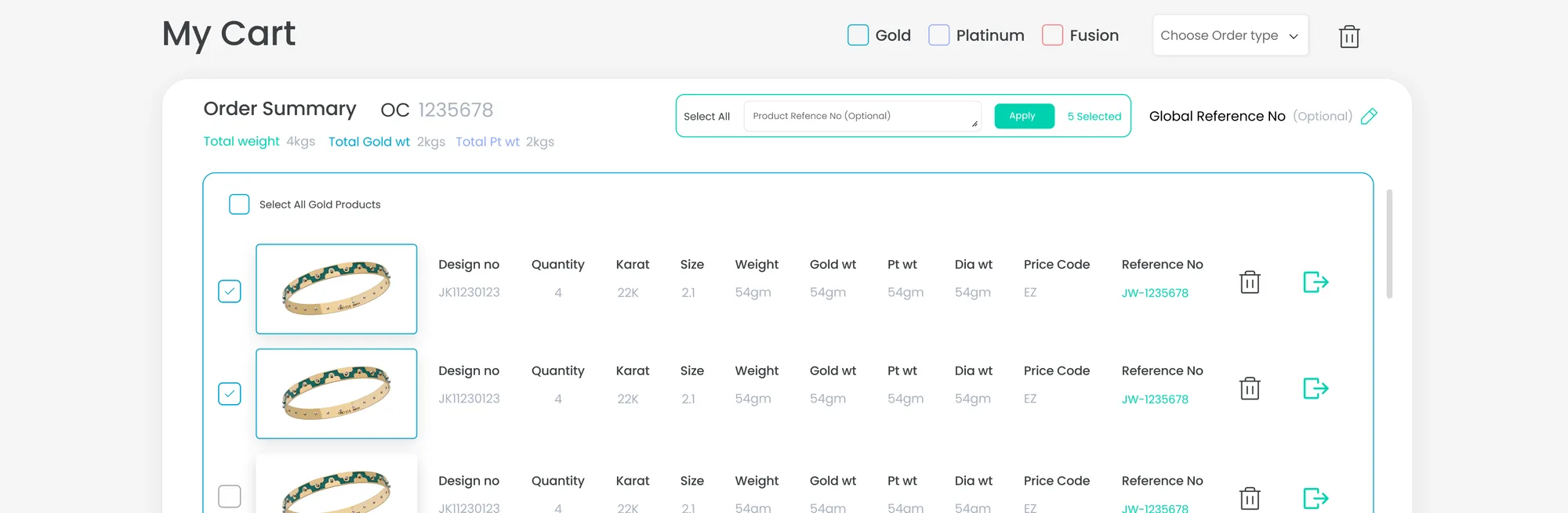
A cart that stays legible under load
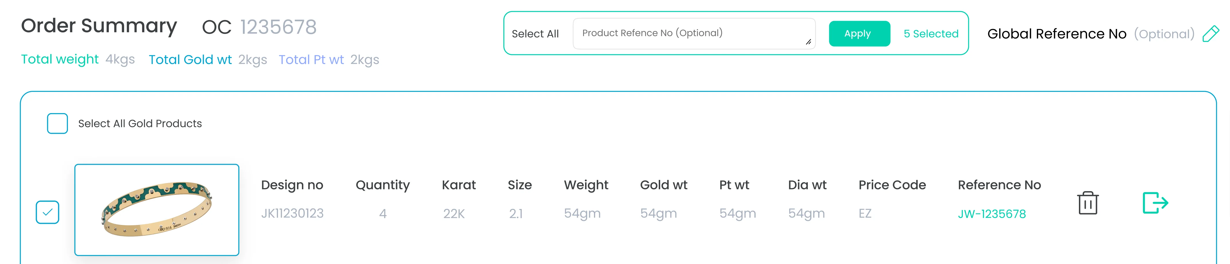
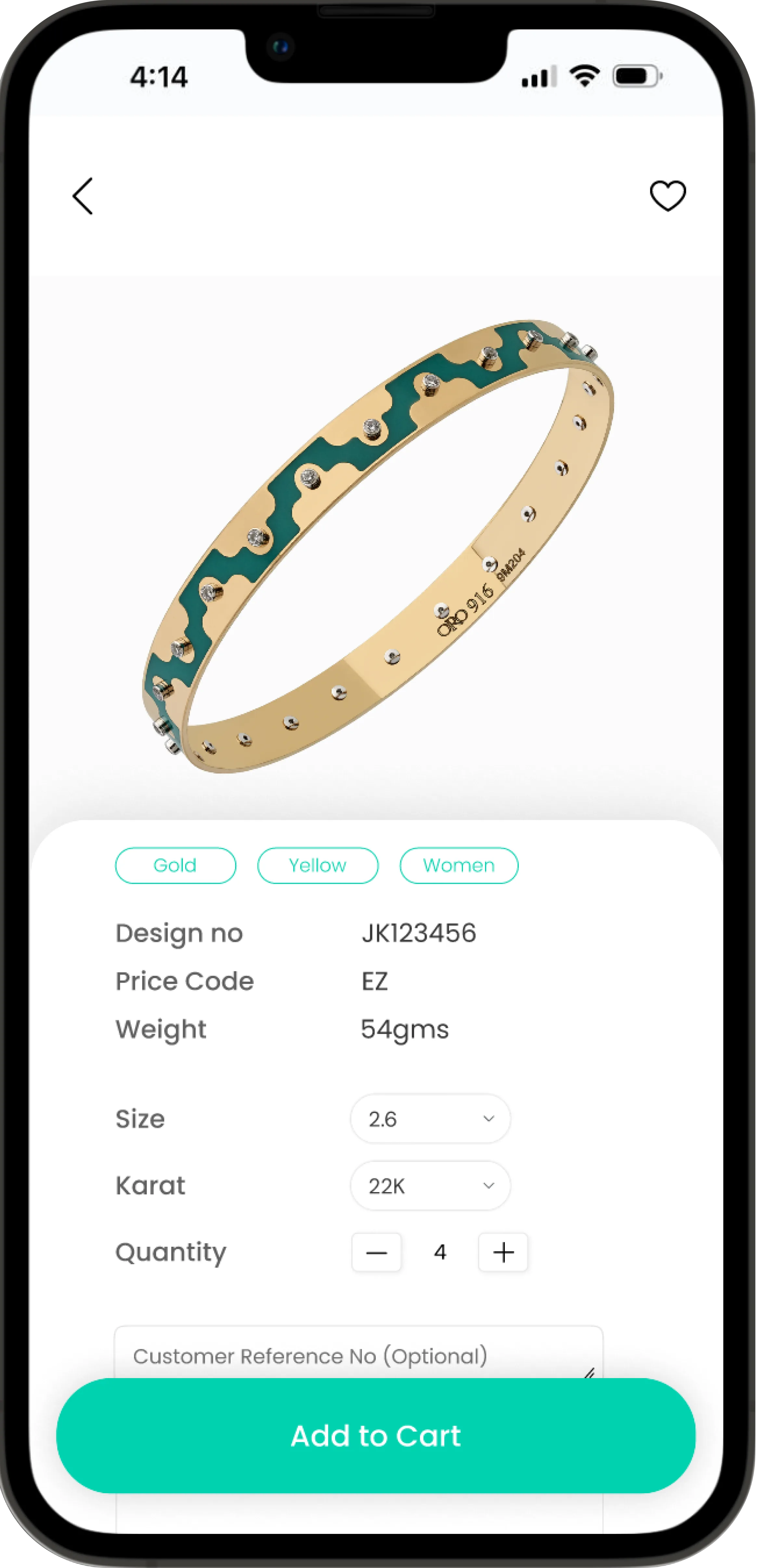
The cart had to showcase a bulk order made of many unique items, each carrying its own custom reference number, against designs that already have a unique ID generated by the factory. Navigating existing flows and creating a seamless experience for this was the hardest and most enjoyable problem in the project.
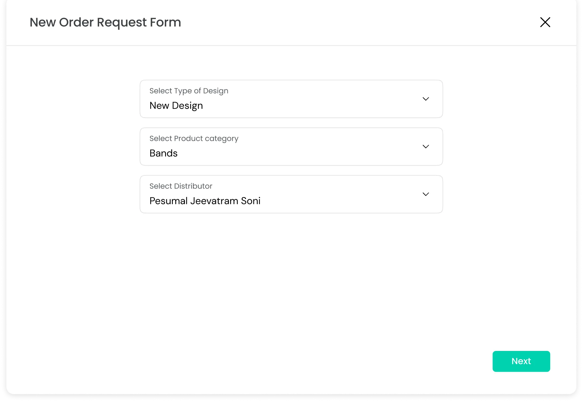
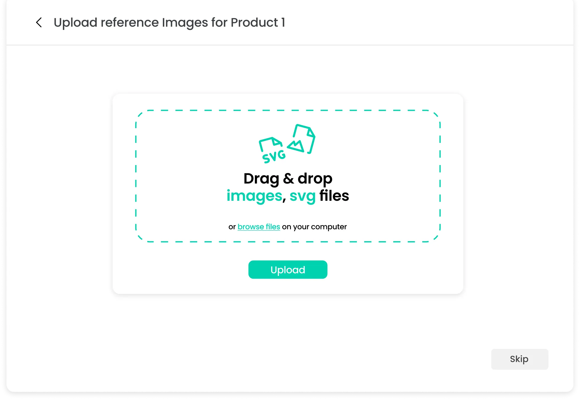
Requesting something that does not exist yet.
A design request flow that stays out of the way
Clients regularly want to order or request new types of design from the business. The request form is deliberately elaborate — it has to capture enough for the factory to act on — but it lives inside the hamburger rather than the main flow, because it would otherwise clutter the path that every buyer takes for the business to keep making new designs every time.
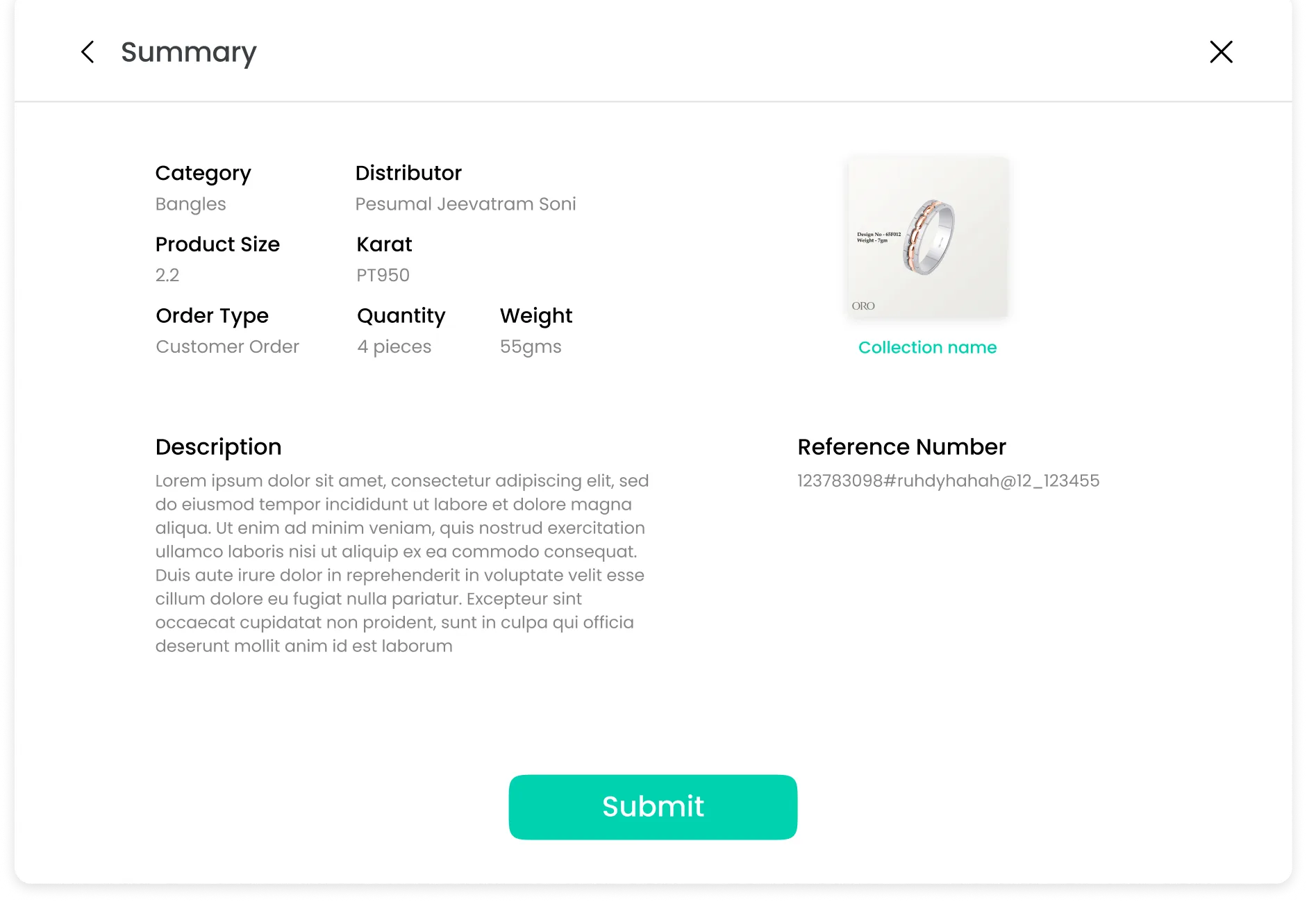
The reorder path the traditional buyer forced.
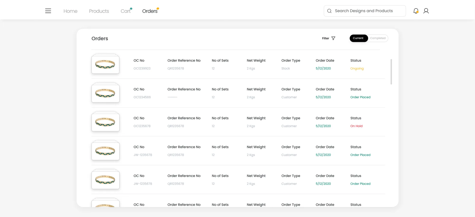
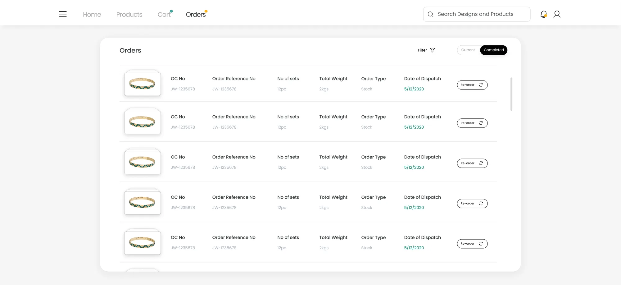
Orders that carry their own history
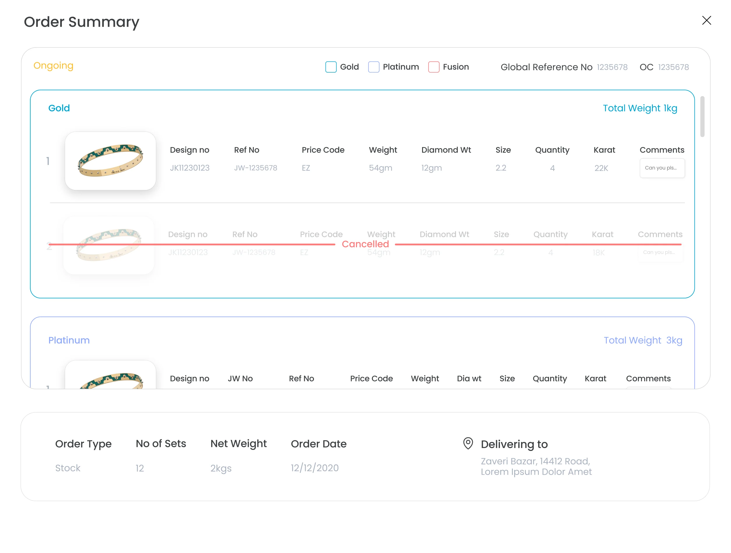
Past orders are a first-class surface rather than buried history. Current orders expose real state — ongoing, order placed, on hold — so a buyer waiting on gold knows where it is without a phone call. Completed orders put re-order on every row: the fastest path to a repeat purchase is the record of the last one.
The states nobody screenshots.
Onboarding and failure, designed on purpose
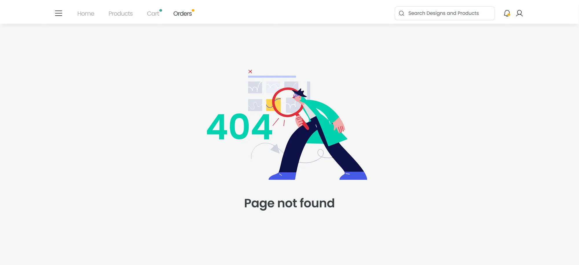
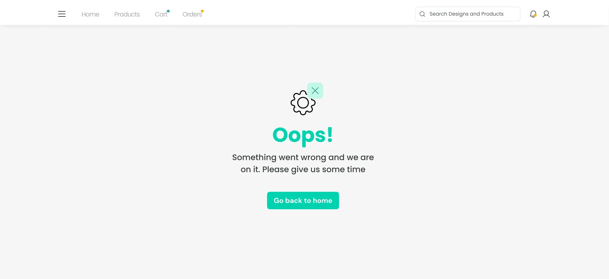
Sign-up captures GSTIN and company name because this is a B2B account, not a consumer one — the business relationship is established at the door rather than reconstructed later. The error and not-found states were designed rather than defaulted: on a platform where a buyer is committing to a bulk gold order, an unexplained failure is expensive to trust.
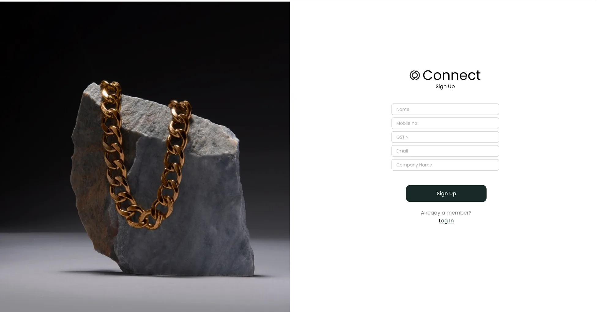
Three decisions where the obvious option was cheaper to build and worse to use.
01 Two ID systems that had to coexist without a human translating
The tempting option:
Standardise on ORO's internal design numbers. One source of truth, no mapping layer, least to build.
The problem:
It moves the entire cost onto the client. Buyers already track their orders by their own custom IDs inside their own systems — telling them to adopt ORO's vocabulary means they either maintain a translation sheet forever or keep calling ORO to translate for them. That is the exact dependency this project existed to remove.
What I chose instead:
A two-level reference system on the client side, reconciled against the factory's own encoding. A Global Reference No names one instance of a bulk order. A Product Reference No names one customised product inside it — so two products sharing a design but differing in detail may or may not share a reference, which is why it is a checkbox state that lets a buyer change one type of product order or several at once. Underneath, the Design No and Job Work No stay unique and factory-generated.
Why?:
The system should absorb the complexity, not the customer. Both parties already had working vocabularies. The failure was never that one of them was wrong — it was that the software refused to speak either one fluently.
It only works as a pair. Client-side references alone would drift from what the factory builds; factory numbers alone are what forced the phone calls. Holding both, and agreeing them on the same order, is what lets client and business navigate to a specific order need without a human translating.
02 A cart carrying more information than any one screen should
The tempting option:
Simplify the cart. Show line items and totals, push specifications and customisation into a separate step.
The problem:
Hiding specifications is fine for a consumer buying one item and dangerous for a distributor approving a large order. If verifying the order means opening every line separately, buyers stop verifying — and an error found after production is enormously more expensive than one found in the cart.
What I chose instead:
Keep everything on one surface and spend the design effort on structure — hierarchy, grouping and editable-in-place customisation, so density stays scannable rather than becoming noise.
Why?:
Low cognitive load is not the same as little information. The buyer needs all of it. What they do not need is to hunt for it. The work was in making a dense screen legible, not in making it smaller.
A second product, not a squeezed one
I designed a separate mobile version whose entire purpose was making bulk ordering easy on a phone. Buyers on the road — walking a shop floor, standing in a supplier's showroom — were never going to complete a multi-line gold order on a shrunk-down desktop grid, and treating mobile as a responsive afterthought would have quietly excluded the traditional buyers who are least likely to be at a desk.
What the redesign actually changed
Ordering stopped depending on memory. The old flow required buyers to produce internal design numbers before they could transact. The new one lets them recognise products visually, search by intent, and reorder from history — removing the single most common cause of both mistyped orders and support calls.
The backend dependency became a design problem, and got solved as one. Every workaround the old system relied on — phone calls to confirm design numbers, humans translating between two ID schemes, spreadsheets kept on the client side — was an interface gap being patched by labour. Carrying both identifiers natively removed the translation work rather than automating it.
It was built to scale with the inventory, not just to fit it. 70,000+ SKUs was the starting condition, not the ceiling. Intent-scoped search and a discovery-led landing page both hold up as the catalogue grows, where a text-match search over a flat list degrades with every product added.
It shipped as a handoff, and was specified to survive one. Using an established design system and documenting the flows meant the engineering team inherited something buildable rather than a set of screenshots — the difference between a design that ships and a design that gets reinterpreted.
What I would do differently
I did not instrument anything. There were no analytics on the old flow and none specified for the new one, which means the improvement above is reasoned from the interaction design rather than measured — and the honest version of this case study has to say so. On any comparable project now, the first thing I would agree with stakeholders is what we are going to measure and how we will know it worked.
The second is that I designed for four personas without ever putting the prototype in front of one. The profiles came from stakeholder knowledge, which is real but secondhand. A single session with an actual bulk buyer would have tested the reorder path and the cart far more sharply than any amount of internal review did.